|
|
Post by The Cats on May 26, 2015 23:21:44 GMT -5
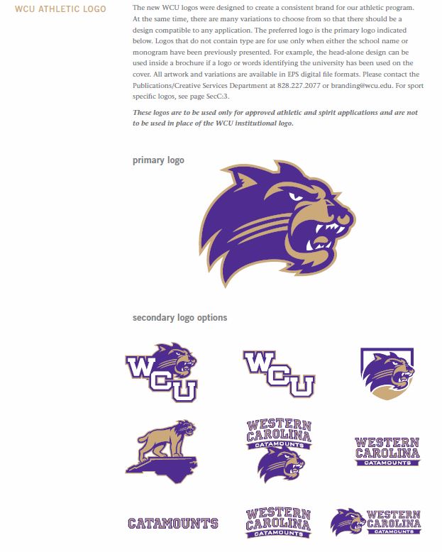
Back in 2008, the university under took a new branding effort with new athletic logos. Number 1 below is actually a secondary athletic logo (the Cat head alone is the primary athletic logo per the official "ECU style manual), but is the one must recognized by most as THE WCU logo. Introduced approximately one year ago by the football program, was a new secondary logo (#2 below). I'll call it the TCU model. Which WCU athletic logo do you prefer? #1 #2 #2  |
|
Deleted
Deleted Member
Posts: 0
|
Post by Deleted on May 27, 2015 5:34:24 GMT -5
That's a problem at WCU, every week, we change the logo.
|
|
|
|
Post by CharlotteCat on May 27, 2015 7:03:12 GMT -5
I agree, but this is a change for the better.
|
|
|
|
Post by BigCat on May 27, 2015 19:24:59 GMT -5
I'll go with the new look, it seems complete with the WCU on top.
|
|
Deleted
Deleted Member
Posts: 0
|
Post by Deleted on May 28, 2015 21:42:55 GMT -5
#2
|
|
Deleted
Deleted Member
Posts: 0
|
Post by Deleted on May 30, 2015 13:57:11 GMT -5
It reminds me of TCU, but also the old 1989 helmets. The ones that were clearly taken from the LSU design. It's something that we tend to do. We've taken logos from LSU, Washington, and TCU, but i think this one is a logo we can get behind. When I went to Western in the early 2000s, no one really had a clue as to which logo could be considered official. In my opinion, they were all pretty bad.
|
|
|
|
Post by The Cats on May 30, 2015 14:09:47 GMT -5
..... no one really had a clue as to which logo could be considered official..... The logos are now in the style manual, published in 2008 -  |
|
Deleted
Deleted Member
Posts: 0
|
Post by Deleted on May 31, 2015 12:30:42 GMT -5
I still love "The Cats" written in cursive from the Waters and Hodgin eras. Classic.
|
|
Deleted
Deleted Member
Posts: 0
|
Post by Deleted on Jun 3, 2015 16:02:27 GMT -5
I still love "The Cats" written in cursive from the Waters and Hodgin eras. Classic. I'm surprised that "The Cats" is not listed as secondary logo. WCU should take ownership, and use it on merchandise. |
|
Deleted
Deleted Member
Posts: 0
|
Post by Deleted on Jun 24, 2015 15:03:31 GMT -5
The new catamount isn't that bad. I still like the leaping cat and will ALWAYS be a fan of the "old eye" logo... Have that old tag on my truck. Favorite by far
|
|

